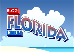
Here is the first logo suggestion I have received. Ray Earhart was kind enough to send it in.
Let me know what you think, but be kind. Remember this was a voluntary effort and is to be appreciated.
A gathering spot for Florida Kossacks to keep in touch with issues of primary concerns to Floridians, or whatever else Florida Kossacks might think worthwhile. Blog Florida Blue

3 comments:
I'd like to see this smaller..a bit bigger than the 'lefty blogs' button. Nevertheless, it looks good and could be used in the future at meetings, It's very artistic.
I was going to say the same thing as union democrats. Its got to fit in a side column in a typical blog template. I'd also like to see a bolder, more impressive and imposing font.
Just my opinion, though.
I do not like this at all. The upside down reflection is very disconcerting to my eye.
PLEASE do not adopt this. Keep trying for something else.
Post a Comment